
New Research Article by Duccio Rocchini: „Under the Mantra: ‚Make Use of Colorblind Friendly Graphs’“
A groundbreaking article titled „Under the Mantra: ‚Make Use of Colorblind Friendly Graphs’“ has just been published by Duccio Rocchini, addressing a critical issue in data visualization—accessibility for colorblind individuals.
Introduction to Colorblindness and its Challenges in Data Visualization
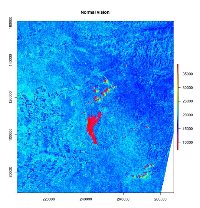
Colorblindness is a genetic condition that affects a person’s ability to perceive colors accurately, often due to abnormalities in the cone photoreceptors in the retina responsible for color perception. This paper highlights the challenges that colorblind individuals face when interpreting scientific graphs that utilize color schemes like the rainbow palette, which can be particularly problematic. Such palettes often present difficulties because colors like green and red, which are confounding for those with red-green colorblindness, are frequently used. The use of rainbow palettes is widespread, but their gradual transitions between colors create confusion for people with color vision impairments.
R Solutions for Addressing Colorblindness in Scientific Graphs
To address these challenges, this paper proposes several solutions developed in R, an open-source statistical software. The authors focus on three main areas: (i) simulating colorblindness, (ii) developing colorblind-friendly color palettes, and (iii) providing tools to convert non-colorblind-friendly graphs into more accessible forms. Through packages such as „colorspace,“ „colorblindcheck,“ and others, researchers can simulate how different types of colorblindness affect the perception of graphs and ensure that the chosen color schemes are sufficiently distinguishable. The viridis package is highlighted as a successful example of a colorblind-friendly palette, designed with colorfulness, perceptual uniformity, and robustness to colorblindness in mind.
Tools for Rerendering Graphs to Improve Accessibility
Additionally, tools like „cblindplot“ are introduced, allowing users to input an image and rerender it with improved color palettes, making it more accessible to people with color vision deficiencies. The authors emphasize the importance of adopting accessible color schemes in scientific graphs to avoid misinterpretation and enhance inclusivity in data visualization.
Advocacy for Accessible Visualization Practices in Science
They also advocate for the integration of tools in publishing systems that allow viewers to alter visualizations to suit their needs, much like existing colorblind simulator websites. As ecological and scientific research continues to evolve, adopting more inclusive practices in data visualization is crucial for ensuring accessibility for all individuals, including those with colorblindness.
See the full text here https://doi.org/10.1002/env.2877